Monday 22 January 2018

OUGD601: Evaluation & Synthesis

COP 3 Evaluation

Evaluating the success of this project will be been particularly hard, due to my split priorities between here and my placement. I have found this module extremely challenging- looking back, I would have chosen a different research topic which has a formal ‘yes/no’ outcome, rather than mine which I feel is shadowed with subjectivity. I have learnt lots about fashion communication - the research process has definitely taught me the importance of both epistemology and practical development side by side, with studio based work informing the research project. The final advertising design for the practical component is a transferable design, utilising a mixture of Caslon, a proud British Typeface and Gothica Moderne, a modern take on Fraktur, reinventing the connotations of the font to reflect contemporary design with nods to history. The structure gives a definable aesthetic to #GetWoke, yet may generate confusion due to the minimalist design, and the use of TheWokening and GetWoke as visual signifiers gives a transferable but connected identity. However, the viewer may question, what is it? Which is when they will go to the website or Instagram, which will feature immersive scroll overs and interactive design. If I had more time, I would illustrate these concepts however that is slightly outside my area of expertise. The image can be altered and fit this format, with the centre typographic layout adjustable where appropriate.

It is also good to note that when getting summative feedback, they understood what each image was about, without the aid of typography, just through art direction and props. Feedback also suggested that I print off the images without the #getwoke hashtag, showcasing the communication on it’s own and testing the audience on what they think each image means, rather than just my feedback group, which could be much broader.


The Survey highlights howe the target audience (millennials) generally consumes any fashion communication, with 75% saying online via social platforms. Looking back, I wish I had illustrated a wider amount of possibilities to utilise this platform, and explaining how the design was informed by popular culture in a better way. The essay could have also been improved, I could have mentioned a wider range of sources (i.D, Dazed & Confused, Kilnfolk, Hunger etc) and not just relate everything back to Vogue. I also could have discussed the DIY publishing movement more as a way to design for protest, using fashion as that signifier. I feel the project progressed enormously throughout the development of research and ideas - furthermore, I have realised that I find it challenging to talk about the graphic communication in high fashion images without relating it back to the clothes, so I wish I had chosen  magazines I wasn’t so connected to, for reasons other than graphic design. I also could have explored more theories within the essay, delving deeper into semiotics and the ethics of fashion communication and fashion advertising. 


Synthesis

Titled ‘Exploring Methods of Communication of the Fashion Image and the Positive and Negative 
Implications they could have on Society’, the research study investigates how fashion advertisements 
and editorials can be a perfect tool for providing a social and historical commentary. Research says
how identities are broken down by what we consume - Baudrillard & Klein, so by using these methods
of consumtion as visual signifiers, we are able to track popular trends and thus allign them with a social
movement, which often corelates to a year. We live in a sophistocated visually litterate society (Sontag).
so by utilising these principles we can transcend elements of immersion and fantasy generally conveyed 
through an aspirational editorial and relate them to real world issues. I explore how high fashion editorials
have the potential to act as tools of escapism, with fashion images often well coded with semiotics to 
form a piece of communication all on it’s own. Art direction, props, location, styling, syntax etc., all 
contribute to the success of that visual communication. However, by living in a image based society, the
spectacle of the image also holds negative connotations, such as The Male Gaze and implications on
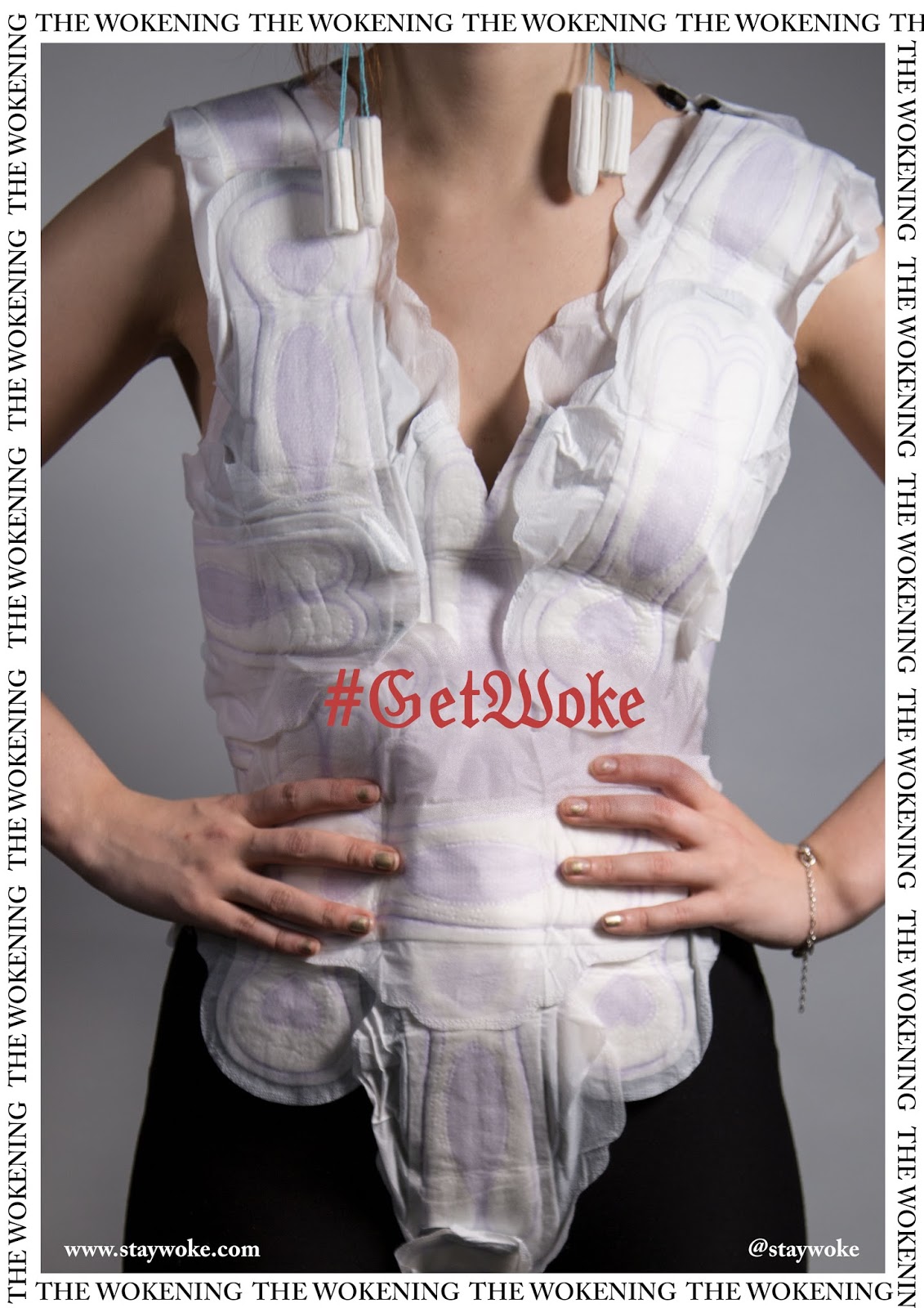
physical health - In response to this, I created poster series advertising a conceptual platform which
showcases possitivly coded imagery. TheWokening is a space for creatives to show their photographic, 
illustrative and graphic work relating to social issues of the day, exploring aspects of reality or fantasy.


In primary research, I discovered that people engaged with creative content most online, mainly through 
social platforms like Instagram- so it was essential to include accessibility for the audience to maximise 
success. After conducting primary and secondary research into current social issues, with the aid of 
feedback. I chose to visually represent 4 issues: Trump’s Presidency, Pro-Diversity, The Tampon Tax/
Fairness between genders and society being suffocated by brands. 


The deliverables are formed into a poster series, advertising a quarterly print magazine, which show-
cases creatives work which tackles contemporary social and political issues, in a lighter way than 
newspapers, targeted at a millenial target audience. Primary research shows that this demographic
does keep up to date on social issues, but only as a byproduct of being online - so more a instagram
and concept website will facilitate this, aided by social media advertising. The design is ambiguous to 
encourage independent research into the movement, as it is designed with openness and translucency 
in mind. It will be accompanied by a concept website, showcasing the editorial content online, as well

as an Instagram page to allow easier interaction with the target audience.

Sunday 21 January 2018

OUGD601: Exploring Syntax - Fina Posterl Series

Series of posters to promote THEWOKENING, social fashion magazine targeting issues of the day. The concept mag will take submissions and also be a way to support artists making cool things to do with social issues. For the practical part of the brief, the outcome will be a poster series, advertising a quarterly print magazine, which showcases creatives work which tackles contemporary social and political issues, in a lighter way than newspapers. It will be accompanied by a concept website, showcasing the editorial content online, as well as an Instagram page to allow easier interaction with the target audience.

I also altered the wording from #StayWoke to #GetWoke as 'get' is a verb and describing the action of attaining something, which theoretically go by the principles of adding aspiration into fashion advertisements.


The outcome uses Barthes' aspect of syntax, forming a sequence with common purpose - as well as sequence being represented through the design to give consistency. The gothic moderne typeface suggests history fused with modernity, legible from distances and versatile in colour combinations. 

OUGD601: Type Experiments

Fraktur Moderne is combining traditional English blackletter type with contemporary typography, reflecting both history and contemporary culture. The use of it here gives a sense of classicality, highlighting that these issues have been around for a long time, and the mindset towards which is also still in the olden days. The introduction of the slender weight and softer terminals give an aspect of femininity to the typeface, which mainly carries connotations of Nazi type and Medieval England. I used this as a starting point to get the visuals down, with the intention to acquire feedback as I go.


Initially, I experimented with the top typeface, Gothic Moderne, however when asking for feedback, it was mentioned that the G and the K are completely illegible - something I had slightly overlooked. The crit also said that the italic Futura was a second favourite, however the use of a "gothic typeface is quite contemporary but historical" and that "edgy fashion brands use that kind of font"- which is the aesthetic I want to go for, incorporating both fantasy (high) fashion and expressive vernacular street culture- something the design and typography needs to reflect.

 After the feedback, I experimented with the letterforms and altered the structure of 'Get Woke', to be more legible, yet still retaining the black letter feel. Elements of ornament hang off the top of the K, G and W, relating to the beauty in fantasy (if Tim Walker was a typeface).


Final template, transferable design. Mixture of Caslon and Gothica Moderne to reflect contemporary design with nods to history. The structure gives a definable aesthetic to #GetWoke, yet may generate confusion due to the minimalist design, and the use of THEWOKENING and GETWOKE - the viewer may question, what is it? Which is when they will go to the website or Instagram, which will feature immersive scroll overs and interactive design. If I had more time, I would illustrate these concepts however that is slightly outside my area of expertise. The image can be altered and fit this format, with the centre typographic layout adjustable where appropriate. 


By having a simple formal layout, allows the type to be moved where appropriate, and so it may sit in negative space. Initially, I felt consistency would be best - the Samaritans mental health campaign was so successful partly due to the recognisability of the design, which was sequential in it's consistency. I asked for feedback in helping with the aesthetics. 

The crit gave some valuable feedback, yet it was not as critical as I would have liked.


Also, as the research project was based on the communication within imagery, by moving #getwoke into the negative space, it allows the image to take centre stage - rather than the typography. Summative Feedback said  "covering the image is changing the hierarchy making the text take centre stage when the image should be and the image is pretty self explanatory...you can tell the hashtag is linked but it isn't taking the focus off the imagery", so flexibility over layout is needed within the structure.

and I know it also features typography but covering the image is changing the hierarchy making the text take centre stage when the image should be and the image is pretty self explanatory, and if the text is below the image, its sharing joint focus like I can see the detail of the image but I'm not missing your hashtag

OUGD601: Instagram Campaign

Utilising imagery I have taken on all 4 shoots, the page is formed of pre-existing work, yet open for submissions. Each image has an appropriate caption and nice story to spread love and awareness of societal aspects, aka, get woke.


OUGD601: Tampon Tax photoshoot

Concept

The tampon tax is one current issue in the public eye- despite being in the country for 20+ years, women are finally rising up and standing against it. VAT is applied to all 'luxury goods' under UK/EU law, therefore suggesting that sanitary products are a luxury item that women buy. Sanitry products ARE NOT a luxury item, they are a necessity for basic health and human dignity- without these products, women's lives for 1 week a month would be even more hell than it already is. 1/10 women in the UK cannot afford sanity products, partly due to the 20% tax; women all across the world are experiencing this issue, with 88% of Indian women having no access to this necessity. 

To show the products as a 'luxury' good, I fashioned 2 packs of sanitary pads into a leotard, a little dress, playsuit and corset top, using Tampons as earrings. The juxtaposition between the functionality of the product and how the prop is being used is what gives this piece concept, yet from a distance may not look completely obvious to the viewer. 


Evaluation

There was a slight change of plan as the model dropped out of the shoot last minuet, and I had no one to replace her who was willing to be covered in products- so I stepped in and modelled for it myself. I was assisted by Anna Farmer who helped with the photography, after briefing her on what kinds of shots I wanted and how I wanted the campaign to be. Initially, I wanted shots with the models face in, yet as I felt having my own face in would ruin the look of the shoot, I decided to focus on the boddess and props rather than the 'fashion' aspect to the image. Looking back, I think this was the right decision and will aid the overall success of the outcome. The impact is in the subtle but obvious use of signs related to tampon tax and feminism in general, raising awareness of women's issues and giving people the opportunity to discuss these issues openly. By juxtaposing clothing with sanitary products, elements of humour are introduced, with a socially provocative underlying message. 

OUGD601: Suffocating in Brands photoshoot

Concept

As a modern society we are suffocated by brands, wether high street or designer. Naomi Klein discusses how brands have a deeper meaning than just logo's, but actually ways to represent ourselves by what we consume and brands we associate with. One can question if all of this is too much - which I personally think it can be - and so wanted to represent the suffocation of brands through a fashion photoshoot (ironic, but important). I introduced cling film within the styling to communicate the feeling of suffocation, wrapping the body in film prior to putting the clothes on, suggesting how deep routed this societal obsession can be. By introducing the iconic Burberry scarf, hinting to the symbolic meaning of brand, the Burberry check suggests high-fashion as it is one of the most iconic and popular prints within modern fashion and street culture. Adwoa Aboah featured in and art directed the 2018 Burberry campaign in a similar setting to the one I used, suggesting campaign similarities.


Evaluation

As I had a clear idea of how I wanted the shot to be, I didn't do as much of a large photoshoot as I did for diversity. I used up the last few frames of a role of film, suggesting nostalgia through the technical process and soft tonal qualities. I tried to utilise some beautiful natural light, reflecting some of the most beautiful fashion images of all time (in my opinion). Despite being shot spontaneously, they came out really well in terms of communicating the idea of suffocation through a fashion image, although I could have represented it in clearer and more literal senses. By doing a studio shoot, I would have had more flexibility over aesthetic and the end result- possibly doing some close up shots of the face with cling film over it giving a physical feeling to the audience when viewing the final image. In the future I will conduct a larger photo shoot, giving myself a wider range of images to choose from, as well as maybe shooting digital to give myself this freedom.

OUGD601: Diversity photoshoot

Concept 

In the wake of post-brexit hate and hate crimes rising, I wanted to represent the positives of diversity through a shoot involving people from every continent in the world, highlighting how integration is a positive thing for society. I tried not to use the models as 'ticks in boxes', yet have chosen to represent all sexualities and ethnicities, as well Morris (with blue hair) who identifies as gender non-binary. The concept is all about positivity and acceptance, in a time where politics is pursuing divides amongst communities. 


BTS

Best shot- identity signified as well as body possitivity


Evaluation

Shot at The Tetley in a make-shift studio, I collaborated with a wide range of models, promoting diversity and happiness for all. The choice of minimal styling is to show off people in their natural forms,  which worked quite well. I asked the models to showcase their imperfections or aspects of themselves (or at least their appearance) that they don't like, and so act as a tool to inspire others to love how they look as well. The models loved the idea, however if I had the chance to do the shoot again I would use a wider pool of body types, rather than just the available models for that time and date. Including different sizes would give another dimension to the photographs, so they look more relatable to the audience and less 'model like'. The atmosphere on the day was extremely positive, with laughter constantly giving the images a positive, up beat vibe. 

Despite the lack of formal styling, I tried not to portray the subjects in a sexualising way to showcase more body positive vibes, as apposed to pre-dated sexualising stereotypes commonly found in magazine imagery. The male gaze generally dominates images, however I wanted to make the natural beauty shine through, and so gave the models very minimal direction, rather allowed them to express their natural selves and do whatever felt comfortable to them. I feel the images are successful to achieve the aesthetic I was going for (similar to the Dove campaign), as well as expressing positivity and inclusion through diversity.

OUGD601: Final Concept

To decide on what fits the synthesised project the best, I acquired feedback on my ideas as a whole, after explaining my conclusion from the critical report. I shared my ideas and ambitions as whole, yet wanted to see what the crit group would feel is the most appropriate avenue to go down.

I created a tally above each of the final 3 ideas, making people fill in what they thought was most appropriate.


I then did some additional research, as well as asking the crit their opinions and made a mind map of social issues I could represent through visual communication. This will be done by using Barthes' 6 principles, including pose, sequencing etc.

Titled 'The Wokening': A term inspired by @everyoutfitonsatc's 'Woke Charlotte' meme, which is a state of play the internet is moving into. Meme pages such as 'Existential Nihilist' or 'Dank Memes Melt Steel Beams' have started using the term 'woke' when discussing audience awareness of a social issues. Often referred to regarding issues of racism (Black Lives Matter Movement), white privilege, consuming habit awareness and capitalism in general , the slang word is becoming increasingly more common in popular culture.

The hashtag #StayWoke is becoming more common in Twitter, Instagram and even Facebook- a platform where hashtags are rarely used, which emphasises how common it is. The hashtag acts as a joiner between any visuals, as well as providing a platform for the audience to go and find out more information about selected issues. 

Considering primary research and feedback, most millennials, (which is my target audience), connects with fashion imagery via Instagram and digital platforms, so it is essential that the practical solution caters for the digital audience despite being editorially focused. 

The outcome will be a poster series, advertising a quarterly print magazine, which showcases creatives work which tackles contemporary social and political issues, in a lighter way than newspapers. It will be accompanied by a concept website, showcasing the editorial content online, as well as an Instagram page to allow easier interaction with the target audience.

The #StayWoke is a term used in social contemporary culture, meaning to be aware of social issues and 'woke' in the sense to form your own opinions not just based on what the media is saying. Critical academics such as Noam Chomsky have discussed how we do not live in a "free state", and we are actually being controlled by the 1% and authoritatively ruling publishing companies & newspapers to feed us their own stories and points of view, despite often being incorrect or very one-sided. By reclaiming this hashtag to #GetWoke we can suggest and ignite action, rather than just 'staying' the same level as they were before.

The critical essay investigates both advertising and editorials, with the similarities of communicative fashion images to entice the viewer and code the image in a way which gives it independent meaning (semiotics). I will represent 4 issues, all through different ways, decided on by feedback into what people think was the biggest issues of 2017 (survey, internet articles, newspaper articles and discussions with people).


Saturday 20 January 2018

OUGD601: Exploring Idea 03

Poster Layout Development

After analysing Vogue's typography for the previous development, I noticed they have quite tight leading as well as mixtures of type. I wanted to use aspects of high fashion editorial (Kilnfolk, Hunger etc..), and promotional design (JW Anderson Exhibition), yet mixed with connotations of street culture and contemporary fashion advertising.
I used this type guide as a rough template to stick to for central text


Friday 19 January 2018

OUGD601: Exploring Idea 02

Developing the type editorial

I chose to explore the risky idea of recreating editorials, with only the typographic content. By removing the visual communication from advertisements and editorial layouts, I intend to highlight the necessity of them - relating to my dissertation.  The project could have gone in many directions, including utilising fantasy and immersion to deliver an experience to the audience. However, by purely focusing on the linguistic message I will illustrate how alternative forms of communication are needed, apposed to simple traditional graphic design. The project is a satirical concept, showcasing the necessity for the two to work in harmony. 

<barthes quote>

First experiment


Original Magazine Scan - quite simple in design and not too reliant on images. The visual communication here is less important with the president on the linguistic message to outline what's in the issue. A narrow grid system was used to create the narrow typographic/image columns.


Here the only tools of communication the viewer has, is typography and layout- nothing else. The absence of imagery can act in two ways- detract the audience from engaging with the page due to the lack of visual stimuli and colour, or alternatively, make the viewer more focused on the information of what is in the magazine as the only thing they can concentrate on is the type.

I chose to parody Vogue, selecting the same typeface, kerning, leading and grid system to comply with their conventions, yet remove the 'fantasy' from it's pages. 

The use of typography and layout is still more interesting than that of other publications (the newspaper for example), as creativity has gone into the subtle mixture of fonts and line lengths, highlighting to the viewer that the information is segmented and still relevant to the Vogue reader. A mixture of italic, capitals, lower-case, bold and regular weights give a variation to Bodoni, yet allowing a stylistic consistency across the page, indicating to the viewer that it is still Vogue, despite the lack of images.

Development Screenshots //


Second / 3rd Page

The original spread, quite simple in design and quite reliant on some form of image. A narrow grid system was used to create the narrow typographic/image columns.

With placeholder boxes


First page: 


Alternative version without any placeholder rectangles. By removing the suggestion of images from the page, the viewer is only receiving the linguistic message and grid system, with narrow columns (at this screen perspective), illegible. I parody'd the exact page design, overlaying them in photoshop and opting for Vogues typefaces, Bodoni Italic, Bodoni Bold and Avenier Regular. The mixture of traditional and contemporary typefaces speaks for Vogue's brand, which does draw on history yet with a contemporary spin.  Despite this, if a typographic layout was done in the 'real world', then the negative space would have potentially been filled up more, as to be more legible to the viewer and utilise the page more. Never the less, in conventions, magazines such as Vogue do maximise on negative space to give the illusion of wealth of space.

It was difficult to copy the type exactly in this way as - looking back, I should have recreated it on illustrator, using the same grid system as Vogue grid (6 column) 


As excellent execution was important for the success of this outcome, I wanted to make sure the recreation went into tiny detail, so I altered the kerning and typography where appropriate to get the right effect.


   <photograph of print out zine>


The overall success of this concept would depend on the execution and feel to the tangible magazine. The cost and time of reproducing a whole magazine in this style, isn’t really 
possible. Comparatively, incorporating photography would synthesise better with the essay.