Video on Dazed and Confused where Vivienne Westwood discusses the punk design process which influences her clothes. The mediums of production all stem from what you could do at home, reflecting the DIY punk ideology. The typography featured is always fluid within the design, yet connoting a reference to the garments inspiration. Westwood says that she and Malcom McClarren "invented punk", suggesting that her clothes influenced a collective societal perception, stemming even before The Sex Pistols. This in turn influenced Graphic Design, with the hand rendered or political typography being conveyed on garments and in ads. Her designs stem from subculture, contributing to a development in identity and diversity within society.
Vivienne Westwood Ads
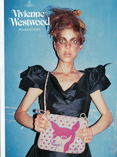
Vivienne Westwood challenges commercial advertising by not conveying to the idea that beauty lives on a catwalk, nor saying that beauty is restricted to the young. Westwood herself often models in the advertisements challenging current conventions, as well as incorporating vivid editorial layouts for the distribution of this graphic media. Her brand style is playful and quite 'anti-fashion' to an extent, providing an outlet for the consumer wanting to have fun like those within the ads.
Westwood embraces sexuality and exudes empowering energy through her presence in the pictures. The angles used throughout her adverts are from a relatively low angle, never position humans as weak or insignificant from a mise-en-scene perspective. The introduction of typography sits clearly within the photographic composition, showing a relationship between the brand identity in ads and the logo. Vivid colours and humour codes are used, featuring aspects of social reality incorporated in an out-of-the-ordinary setting. The ad is positioning the viewer as the onlooker of a scene of joy, as well as unusually due to the high fashion nature juxtaposing the location of a laundrette. However, as the typography signifies this advert is for V.W 'Man', using Mulvey's thought process the positioning of the blonde woman in the trolley suggests that she is only there for scophophellic pleasure, especially as she is caged by the parameters which surround her. The styling and short dress connote party scenes of drunken-girls falling, something which has been seen in aspects of society.
 |
In this editorial Westwood is raising questions of identity, as well as fulfilling a desire and exclusivity within the new range. 'To be the King and the Queen' highlight a success which can be obtained by purchasing the product. The use of the term 'king' and 'queen' may reflecting the monarchist views Westwood has, with questions about bourjoise and class being highly topical when referring to Punk. In addition, the use of two female models (rather than a male for the 'king'), is breaking gender conventions yet again, suggesting that such titles are merely a label we can put on ourselves limitless to gender. The incorporation of the crowns gives an air of importance to the figures, possibly highlighting the black model as the 'king' and 'dominant force' in the situation. The design principles used breach modernity and postmodernity, using design principles such as negative space and clean structures to outline her (often controversial) content.
Westwood challenges the idea fashion advertising, by not exposing any form of gaze onto the models- as there are none. The removal of human presence adds an anarchistic undertone, suggesting demolition and reincorporation of a public space, quite unconventional and echoes Gurilla advertising tactics. Personality and character is given to each stick mannequin, giving the viewer an idea of the garments, yet the consumer intrigue is placed on the brand. By stepping away from the preset advertising conventions for fashion brands Westwood adds a USP to her brand profile, rejecting the objectification of sexes in favour for a punk anonymity. The brand is positioned as a creative, rule breaking society which may go into public places at night to communicate their message, instilling a sense of community within the target audience. The clinicisim of the logo and compositional values of the advert convey with modernist principles, clearly outlining to the viewer that the clothes are Westwood Gold Label. Furthermore, the state of disregard the clothes are being treated in juxtaposes the pre-set ideas of a 'gold label' range, which is generally held with the highest prestige and care, represented as the pinical of beauty and status within fashion's society. Political statements are common within the Westwood language, as well as raising discussions on class and social position. Despite this, her brand strategy still positions these clothes as 'unattainable' by the large price tag accompaniment. By Westwood doing this we are repositioned as an audience/society to want different things- the ideals Westwood is demonstrating on the high platform stem from D.I.Y, which is still easily attainable for the viewer. One could argue that she is marketing at such a high price tag to exploit/target those with the high disposable to indulge in such products(?).


No comments:
Post a Comment