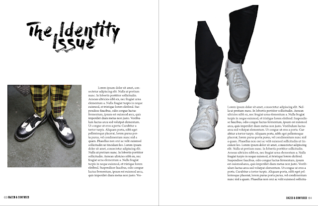
As the distribution and purpose of this practical piece is to feature inside Dazed and Confused, both online and in print, I took the practical sense to design backwards, working out the hierarchy of images and content. When researching into editorials and how to construct the 'perfect' harmony on the page, I came across a few pieces of information saying a magazine editorial has maximum effect at 5 pages long. As 5 pages is not a lot to fill, I thought deciphering that first would give a clear indication in to how to conduct the online aspect, as well as how a digital copy would work on screen.
I experimented with initial covers, using a brush stroke type as the foundation of the development. The blue is constructed from a colour pick of the subjects skirt, which will feature as a running colour swatch throughout the design of the issue. The candid Mario Testing style looks grainy in nature due to the editing style and use of flash. The high-key nature suggests an interrogating approach to assessing individuality, whilst relating to a lot of the 1990's lomography style advertisements and editorial issues.
Expressive typography related to Dazed and Confused aesthetic and fluid style. A combination of typefaces all representing different things, fusing together to form an identity. I opted for a quote by Brenda Shosanna, an psychologist and writer about receiving anxiety and stress. She focuses on happiness and I felt this quote was particularly relevant in terms of this topic, as no matter how much as consume, if it is not us then our identity is untrue and as humans we deserve better than that.
After constructing the basic editorial, I wanted to break away from the standard presentation of imagery and see if something more unique and creative could be made, purposeful for content in the editorial and for online medias.


No comments:
Post a Comment