MAGAZINE & BRAND CONCEPT
New concept magazine where branding and identity reflects positive codes and sunconcious messages, corresponding to the new age, embracing empowerment and aspects on society as its focus. Taking all the core principles of advertising (so constructing something with the overarching aim of selling), in a way that is not obviously an advertisement. For this, I need to consider cannons for magazine construction, as well branding to create a new conceptual identity. The target audience would be B/C1, whom enjoy indulging in aspects of consumerims yet are perhaps tiring of the pre-set conventions fluid through advertising.
New concept magazine where branding and identity reflects positive codes and sunconcious messages, corresponding to the new age, embracing empowerment and aspects on society as its focus. Taking all the core principles of advertising (so constructing something with the overarching aim of selling), in a way that is not obviously an advertisement. For this, I need to consider cannons for magazine construction, as well branding to create a new conceptual identity. The target audience would be B/C1, whom enjoy indulging in aspects of consumerims yet are perhaps tiring of the pre-set conventions fluid through advertising.
Images and typography will need to be highly considered and will be very time consiming. I could possibly explore using alternative methods of production (such as collage & re-appropriating adverts), introducing a level of surrealism when we consider advertising and the consumer spectacle. (Hattie Stewart’s illustrations over images)
As this would be a printable piece, the stock and binding needs to be consistent with other ‘competing’ magazines, yet rather than gloss, matte 180gsm pages and a 320gsm cover will reflect the grittier side to the message, moving away from the mainstream publications who use high gloss.
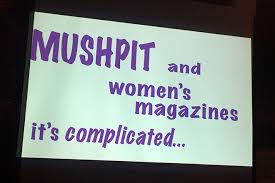
Visual Research


Dazed and Confused article discussing how to produce a successful independent magazine, such as the proposed concept. The article is about preaching empowerment and taking charge of creative freedom and expression through identity. The emphasis is on Print Isn't Dead, reflecting to a more niche target audience where there is the willing desire and habit of consuming print based goods. This 'Print effect' may effect those with a higher disposable income, or the older generation more, as the tangibility of print is something with historical merit- also associated with quality and tradition. By publishing something in print, it is almost immortalised in the sense it has seen the face of day and hasn't just lived as an idea in a designers head.

Quite kitch and individual in aesthetic, referencing common stereotypes seen through advertising and design for print. Both covers reflect gender in alternative ways, carrying a playful humour throughout its editorial content. The typographic style is nostalgic and 'retro', highlighting the brand as alternative from the standard Bodoni or SanSerif logotype. The images often re-interpret the typical aesthetics of advertising design (white background and models), yet combining hairy arms/legs and other natural things women posses which are frowned upon by the idealistic views normally portrayed in advertising.

No comments:
Post a Comment