Over the course of cop 2 I have tried to incorporate
the aspect of study with a personal passion related to the field of Graphic
Design. Throughout the year I have learnt extraordinary amounts about Graphic
Design and the wider contextual field of design with my particular interest
relaying around social and cultural issues. The lecture program has been a key
insite for developing knowledge, however I wish I had documented these better
and reflected more critically on the works I had learnt. Furthermore, the
development of an essay problem was a huge challenge to me, and this is
something I need to pre-plan for my dissertation. The development of a problem didn’t
really have a direct-enough path of direction and so confused me when coming to
decipher the essay and subsequent practical. Time management has also been an
issue with this project, something I plan to focus on in the future. I do not
feel the standard of outcome or finish is good enough or acceptable to best
showcase the idea, and really I should have experimented further with
photography and collage styles to further link to contextual research. Looking
forward to COP 3 I plan to be much more focused and organised, not getting so
unorganised with the research I have conducted. I will also contuct a proper
time plan, starting in August to allow a polished solution for COP 3
throughout.
Monday, 24 April 2017
Sunday, 23 April 2017
OUGD501: Dissertation Research
Question: To what extent do Technological developments in production and distribution impact on Graphic Design ?

- 3D Printing
- The Internet as a platform for worldwide communication and distribution
- Increasing tech means we can produce design much quicker via a computer, rather than by hand- Does this mean Graphic Designers have become machines rather than valued most highly for their ideas?

OUGD501: Dissertation Research 2
Looking at the crime industry, often perceived in negative ways- are their ways that Graphic Design can alter perceptions about historical gangs/crimes to show a different side to them- furthermore, are their business cards a reflection of their character and ethos, or simply unconsidered design? An Article on Its Nice That uncovered business cards from old Chicago gangs, and the nostalgia within the images looks almost replicable in todays age for the same purpose.


In the aftermath of events such as Brexit, the nation of ever more divided in our views on the rest of the world. Looking back in years to come, how will the future generation studying the 21st century look at the information and graphic design they are presented? Will they think that we all have the same view or will graphic design aid the future generations in de-mistifying the truth.
Memes and online articles will/have become the newspapers of our day, which may mean people take what they say more accurately than often news platforms.

OUGD501: Practical Developments 03
After getting the content to work in a follow fit for editorial print distribution, the challenge of transferring it onto Dazed's online platform was not to hard. The digital subscription version of the editorial would be exactly the same as the print version, only featured online.
Using the Dazed article template to reconstruct the web:
 |
| Initial mock up- what the audience will see when they click onto Dazed. |


OUGD501: Practical Developments 02
Experimenting with collage
Inspired by Dazed and Confused, I wanted to incorporate aspects of constructing imagery outside of advertising/editorial designs pre-set aesthetic styles. The use of collage reflects a postmodern DIY aesthetic, whilst possessing abstract and surreal qualities.
These act as fun little pieces of content to break up the photographic element, yet derived from aspects of the photoshoot and surrealist composition. The typography is a work in progress at the minuet, yet something expressive of character and identity is needed to harmonise with the content.
The concept behind the strange leg figures is combining the aspect of consumerism we are identifying, morphing them and combining multiple charecter profiles together to create one solid force of diversity and intrigue.


If time was no issue for this brief it would be interesting to write the 'Dazed' header (or 'Identity Issue') in letters constructed from imagery. In experimenting with compositions and digital collage I created an 'A' letterform, physically made from aspects of identity.
OUGD501: Practical Developments 01
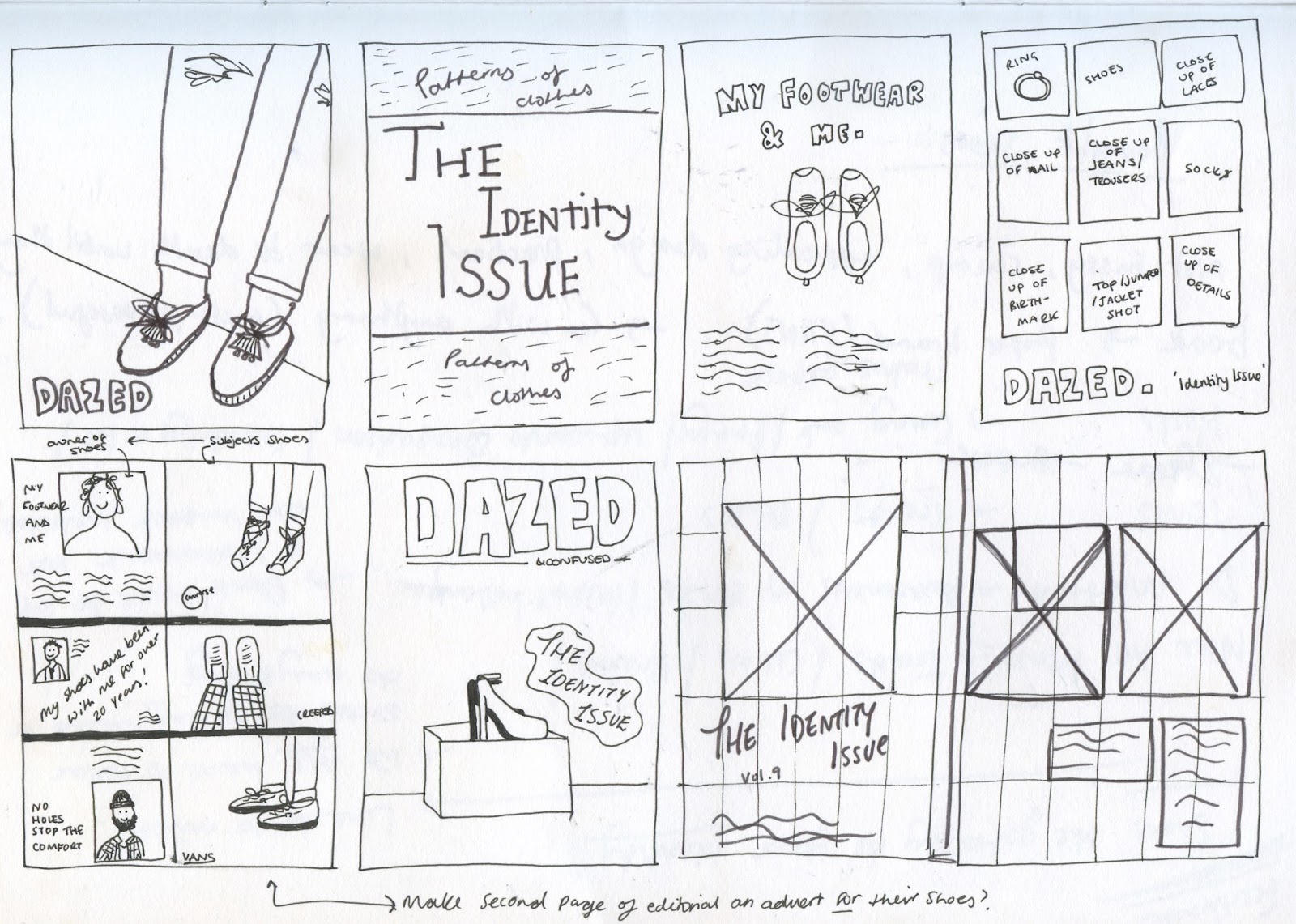
As the distribution and purpose of this practical piece is to feature inside Dazed and Confused, both online and in print, I took the practical sense to design backwards, working out the hierarchy of images and content. When researching into editorials and how to construct the 'perfect' harmony on the page, I came across a few pieces of information saying a magazine editorial has maximum effect at 5 pages long. As 5 pages is not a lot to fill, I thought deciphering that first would give a clear indication in to how to conduct the online aspect, as well as how a digital copy would work on screen.


I experimented with initial covers, using a brush stroke type as the foundation of the development. The blue is constructed from a colour pick of the subjects skirt, which will feature as a running colour swatch throughout the design of the issue. The candid Mario Testing style looks grainy in nature due to the editing style and use of flash. The high-key nature suggests an interrogating approach to assessing individuality, whilst relating to a lot of the 1990's lomography style advertisements and editorial issues.

Expressive typography related to Dazed and Confused aesthetic and fluid style. A combination of typefaces all representing different things, fusing together to form an identity. I opted for a quote by Brenda Shosanna, an psychologist and writer about receiving anxiety and stress. She focuses on happiness and I felt this quote was particularly relevant in terms of this topic, as no matter how much as consume, if it is not us then our identity is untrue and as humans we deserve better than that.


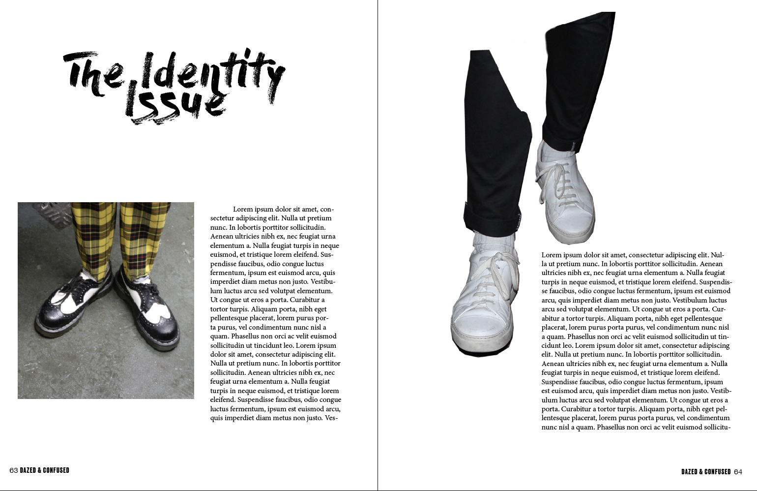


After constructing the basic editorial, I wanted to break away from the standard presentation of imagery and see if something more unique and creative could be made, purposeful for content in the editorial and for online medias.
OUGD501: Studio Brief 02- Primary Research + Sourcing Images
After Pitching my idea to Beth and receiving additional feedback about how people identity with objects (shoes as a primary example) being a key signifier in the role of portraying who we are as individuals.


I conducted a brief photoshoot at a popular venue in Leeds, where lots of diverse characters socialise and don't necessarily conform to set trends. People were really happy to be photographed and everybody responded well to positive comments on their footwear. Where possible I asked everyone questions about the meaning of their shoes to them, and tried to converse to find out if that particular consumer item has impacts their identity.
I found that everybody willing to take part agreed that their shoes represented something about them, or was acting an an extension of their personality. This confirms the route of looking at shoes to represent object of consumerism, as every single person I asked/have asked in feedback all feel that shoes are a key aspect of who you are as an individual.
The project is not about judging or looking down on others for not having 'fancy footwear', but expressing the individuality and the stories these perticular aspects of consumerism can cary. I spoke to 4 people when taking photographs whom were all wearing Vegan Doc Martens; they said how they loved the shoes previously but since becoming Vegan didn't feel right to keep the aspects of leather or animal cruelty. They have since re-consumed and take comfort in knowing what they consume their shoes hold just as much integrity as their personal ethics.


These are the first images shot in conjunction with the proposed editorial. I wanted to keep the style of photography quite playful and candid to reflect a snapshot diary style, emphasised by the flash in many cases (taking influence from works by Mario Testino). The images didn't come out as well as I would have hoped but will nposses the desired aesthetic quality after being edited in Lightroom.
<Feedback scan>
OUGD501: Dissertation Research 1
Question 6 : To what extent has Graphic Design constructed our understanding or view of historical events and perceptions of truth?
"All truths are easy to understand when discovered; and the point is to discover them"- Galleleio
- Graphic design has aided in masking and covering up world issues, as well as propaganda and the mass media selling us lies.
- WW2, newspapers telling widows troops were okay
- Red plaques as appose to blue English heritage plaques (socialist revolutions)
- Paris, May 1968.
- In the US Reagan days the black man was perpetuated as a savage, as a criminal and a rapist of white women by the press and TV media. They only made black men feared became they needed them working in the fields and in low paid work, aided by design, to contribute to their profit. They were never going to be given a chance of a life whilst the economy needed saving.
- Injustice and societal preducide is rising again and has the possibility to be covered up by design, police misuse of power is happening much more in the USA especially, and in turn more groups/movements echoing previous political design start emerging- e.g.: Black Lives Matter.
- Commercialism said integration would never work so racist ideologies remained at the surface, yet when we look at the past it was actually the youth and the subcultures which broke down those racial barriers, proving that with the power in the peoples hands (and the right societies hands) we may be able to start a fresh with a new society like postmodernism.
- Explore the portrayal of the black civil rights in the late 20th century, with emphasis to how hip hop is represented
- Focus on US or UK events - or somewhere else in the world?
- Nazi symbol was originally stems from Buddhism
- Nazi typography (Fraktur) rarely associated with positive connotations
- Political events which have been misconstrued
- False branding and false advertising through history- famous fashion stuff?
- Crimes that have been covered up
- Graphic design helped define modernism and postmodernism visual aesthetic
- Warped events
- Red plaques celebrating modern British events
- When they print the same newspaper with two headlines for two possible outcomes of an election or trial, and send out the wrong ones by mistake
- North Korea as Platos cave
- Graphic Design as a facade
Constructed understanding of truth via:
- news and journalism
- The news
- press headlines and photojournalism
- branding and brand identity which lied in some way
- magazines
- 'False News' - Kellyanne Conway as a smokescreen for Trump
- UKIP Bus vs "we never said we'd give money to the NHS"
- Magazine editorials
- Typography and colour
- Online- Internet articles, online pictures, videos, bloggers, v-loggers etc..
People who live in a alternate version of reality, especially from birth, may have not been subconsciously coded to fit in and appreciate societies ideals, or question that the information they are being fed could be ungenuine. Just like Plato’s cave, the way the world has become lately is almost unimaginable to those who are 'non-believers', non-consumers and those away from the rat-race of modern life, and in-tune with their basic human nature.
If we only believe what we can imagine and ‘you only know whats there’, in the case of Plato's cave, when you’re taken out of that environment, social naivety can make it a huge transition and subjective information can be taken as fact if it is presented to us in a trusted format (instagram, the news, online articles), via Graphic Design, so we naturally take this as fact without really questioning the truth and essence in what they’re communicating.
Saturday, 22 April 2017
OUGD501: Pitching Ideas
When pitching my three final ideas to Beth Fitton, she gave some really useful feedback. We read over each others essays to make more informed decisions and make sure the feedback we give on the chosen ideas fit more effectively. The pitching was a really great opportunity to explain the idea in lots of detail and how each idea is directly influenced by the conclusion of my essay. This lead to all three ideas being expanded on and developed accordingly...
Idea 01


Idea 02


Idea 03

Developments & Feedback:
By exploring all ideas I was able to develop the concept in Idea 01- showing individuality without indulging in expensive consumer culture. Within my essay I explore how goods construct who we are as individuals, and these facets of identity in turn effect how others see us, and how we position ourselves accordingly. When considering the feedback for Idea 01, Beth said to focus directly on one aspect of consumerism to best communicate the intended message- that individuality is not constructed off the expensive consumer items we purchase, but how we accessorise and adapt items to have a personal significance. For example, some goods may be worthless in cost and yet mean the world to certain individuals; likewise, something which could be really expensive in cost and super on-trend commercially, may have a particular significance with an individual making the cost paid nothing compared to the value that item has to us as a consumer. It is unrealistic to suggest an abandonment of consumerism all together, as that is unrealistic to the society we now live in, yet the aim is to instill the message that its not where you buy it or how much it is, but its what it means to YOU as the consumer which gives its societal value.
 Highlighting Beth's key piece of feedback to focus this on one aspect of consumer culture, we discussed what this could be and in our brainstorming session we identified what objects can be associated with this common culture, especially when advertising and the cyclical consumer cycle is concerned. Shoes are one aspect which we all need to get by socially, from the 'bottom' to the 'top' of society, making a shared ownership of 'shoes' itself a common culture. Shoes are a basic human need which falls under the category of necessary materialism, and can also be split into two categories- cheap and practical, or expressive and often expensive. The footwear we wear says just as much about our identity as our clothes, and can be a contributing factor to how we construct others views of ourselves and in turn effect our own self esteem.
Carrying this aspect forward with regards to Idea 01, the editorial content will be showing individuality, without the 'hard-sell' an exploitative consumer culture. The editorial will be for Dazed and Confused Magazine (mainly the online platform), as this is a pioneering magazine for expressing individuality, yet still very much brand centred in terms of content and attitudes. Furthermore, Dazed and Confused represent a more alternative magazine to the likes of Vogue or Cosmo, who focus more on the products and subsequently advertising the 'ideal', rather than expressing individuality for the sake of expression. Dazed and Confused have a heavy digital presence featuring regularly across all social medias (Instagram/Facebook Boosts/Twitter), as well as their own online magazine reflecting the modern time. The importance of this digital platform as apposed to it being strictly in print, is that the audience must 1) consume the magazine to read the article, making it contradictory in purpose (as the article is based around how identity can be constructed through personal aspects in conjunction with what we consume, so charging someone for that information is unjust) and 2) by targeting a digital platform the possibility of it getting shared to reach a wider audience is more probable, hence inspiring consumers that we cannot fill the dark void inside ourselves by emotionlessly spending, objects must have a significant purpose to us as individuals for them to construct our identity.
Idea 01


Idea 02


Idea 03

Developments & Feedback:
By exploring all ideas I was able to develop the concept in Idea 01- showing individuality without indulging in expensive consumer culture. Within my essay I explore how goods construct who we are as individuals, and these facets of identity in turn effect how others see us, and how we position ourselves accordingly. When considering the feedback for Idea 01, Beth said to focus directly on one aspect of consumerism to best communicate the intended message- that individuality is not constructed off the expensive consumer items we purchase, but how we accessorise and adapt items to have a personal significance. For example, some goods may be worthless in cost and yet mean the world to certain individuals; likewise, something which could be really expensive in cost and super on-trend commercially, may have a particular significance with an individual making the cost paid nothing compared to the value that item has to us as a consumer. It is unrealistic to suggest an abandonment of consumerism all together, as that is unrealistic to the society we now live in, yet the aim is to instill the message that its not where you buy it or how much it is, but its what it means to YOU as the consumer which gives its societal value.
 Highlighting Beth's key piece of feedback to focus this on one aspect of consumer culture, we discussed what this could be and in our brainstorming session we identified what objects can be associated with this common culture, especially when advertising and the cyclical consumer cycle is concerned. Shoes are one aspect which we all need to get by socially, from the 'bottom' to the 'top' of society, making a shared ownership of 'shoes' itself a common culture. Shoes are a basic human need which falls under the category of necessary materialism, and can also be split into two categories- cheap and practical, or expressive and often expensive. The footwear we wear says just as much about our identity as our clothes, and can be a contributing factor to how we construct others views of ourselves and in turn effect our own self esteem.
 |
Feedback asking others what their opinion is of using shoes as a specific example of necessary consumerism with the possibility to effect identity |
Carrying this aspect forward with regards to Idea 01, the editorial content will be showing individuality, without the 'hard-sell' an exploitative consumer culture. The editorial will be for Dazed and Confused Magazine (mainly the online platform), as this is a pioneering magazine for expressing individuality, yet still very much brand centred in terms of content and attitudes. Furthermore, Dazed and Confused represent a more alternative magazine to the likes of Vogue or Cosmo, who focus more on the products and subsequently advertising the 'ideal', rather than expressing individuality for the sake of expression. Dazed and Confused have a heavy digital presence featuring regularly across all social medias (Instagram/Facebook Boosts/Twitter), as well as their own online magazine reflecting the modern time. The importance of this digital platform as apposed to it being strictly in print, is that the audience must 1) consume the magazine to read the article, making it contradictory in purpose (as the article is based around how identity can be constructed through personal aspects in conjunction with what we consume, so charging someone for that information is unjust) and 2) by targeting a digital platform the possibility of it getting shared to reach a wider audience is more probable, hence inspiring consumers that we cannot fill the dark void inside ourselves by emotionlessly spending, objects must have a significant purpose to us as individuals for them to construct our identity.
OUGD501: 3 Solutions (Idea 03)
MAGAZINE & BRAND CONCEPT
New concept magazine where branding and identity reflects positive codes and sunconcious messages, corresponding to the new age, embracing empowerment and aspects on society as its focus. Taking all the core principles of advertising (so constructing something with the overarching aim of selling), in a way that is not obviously an advertisement. For this, I need to consider cannons for magazine construction, as well branding to create a new conceptual identity. The target audience would be B/C1, whom enjoy indulging in aspects of consumerims yet are perhaps tiring of the pre-set conventions fluid through advertising.
New concept magazine where branding and identity reflects positive codes and sunconcious messages, corresponding to the new age, embracing empowerment and aspects on society as its focus. Taking all the core principles of advertising (so constructing something with the overarching aim of selling), in a way that is not obviously an advertisement. For this, I need to consider cannons for magazine construction, as well branding to create a new conceptual identity. The target audience would be B/C1, whom enjoy indulging in aspects of consumerims yet are perhaps tiring of the pre-set conventions fluid through advertising.
Images and typography will need to be highly considered and will be very time consiming. I could possibly explore using alternative methods of production (such as collage & re-appropriating adverts), introducing a level of surrealism when we consider advertising and the consumer spectacle. (Hattie Stewart’s illustrations over images)
As this would be a printable piece, the stock and binding needs to be consistent with other ‘competing’ magazines, yet rather than gloss, matte 180gsm pages and a 320gsm cover will reflect the grittier side to the message, moving away from the mainstream publications who use high gloss.
Visual Research


Dazed and Confused article discussing how to produce a successful independent magazine, such as the proposed concept. The article is about preaching empowerment and taking charge of creative freedom and expression through identity. The emphasis is on Print Isn't Dead, reflecting to a more niche target audience where there is the willing desire and habit of consuming print based goods. This 'Print effect' may effect those with a higher disposable income, or the older generation more, as the tangibility of print is something with historical merit- also associated with quality and tradition. By publishing something in print, it is almost immortalised in the sense it has seen the face of day and hasn't just lived as an idea in a designers head.

Quite kitch and individual in aesthetic, referencing common stereotypes seen through advertising and design for print. Both covers reflect gender in alternative ways, carrying a playful humour throughout its editorial content. The typographic style is nostalgic and 'retro', highlighting the brand as alternative from the standard Bodoni or SanSerif logotype. The images often re-interpret the typical aesthetics of advertising design (white background and models), yet combining hairy arms/legs and other natural things women posses which are frowned upon by the idealistic views normally portrayed in advertising.

Subscribe to:
Comments (Atom)