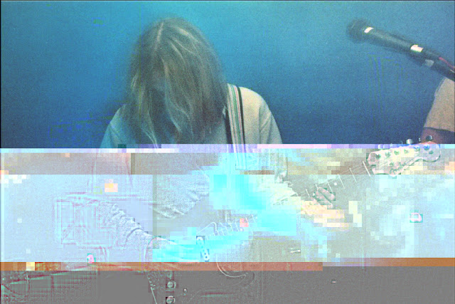
Experimenting with Postmodern techniques prior to settling on any design decisions. After feedback from the previous work I feel I needed to be more experimental, yet experimental for a purpose. By glitching an image digitally, the deformation of the ascetic is acting as counter productive, making the image hard to view.
Initial photographs shot on medium format film by BA (Hons) Photography student Michaela McGuinness of local band Waterfall. The colour combinations of soft mood lighting has been amplified by lens blur and contrast, highlighting the effect of colour on the brain and the soothing nature provided.
Final Idea //
Create a regular manual of Brand Guidelines for record label for Roomae Records. As the question asks for the use of postmodernism in current Graphic Design practice, initially I will design in the way I know how, yet making everything look relatively 'postmodern' in appearance, e.g.: abstract typesetting and vivid colour ways. To make this modern, I will then glitch the 'modern' style making the booklet illegible and unreadable relating back to Postmodernism, breaking the rules.
I want to create a underlying mood suggesting a modern booklet was made, the designer then though 'fuck this' and glitched it to make it postmodern.


No comments:
Post a Comment